Hotel De Jesus
WeddingInvitation
graphic design
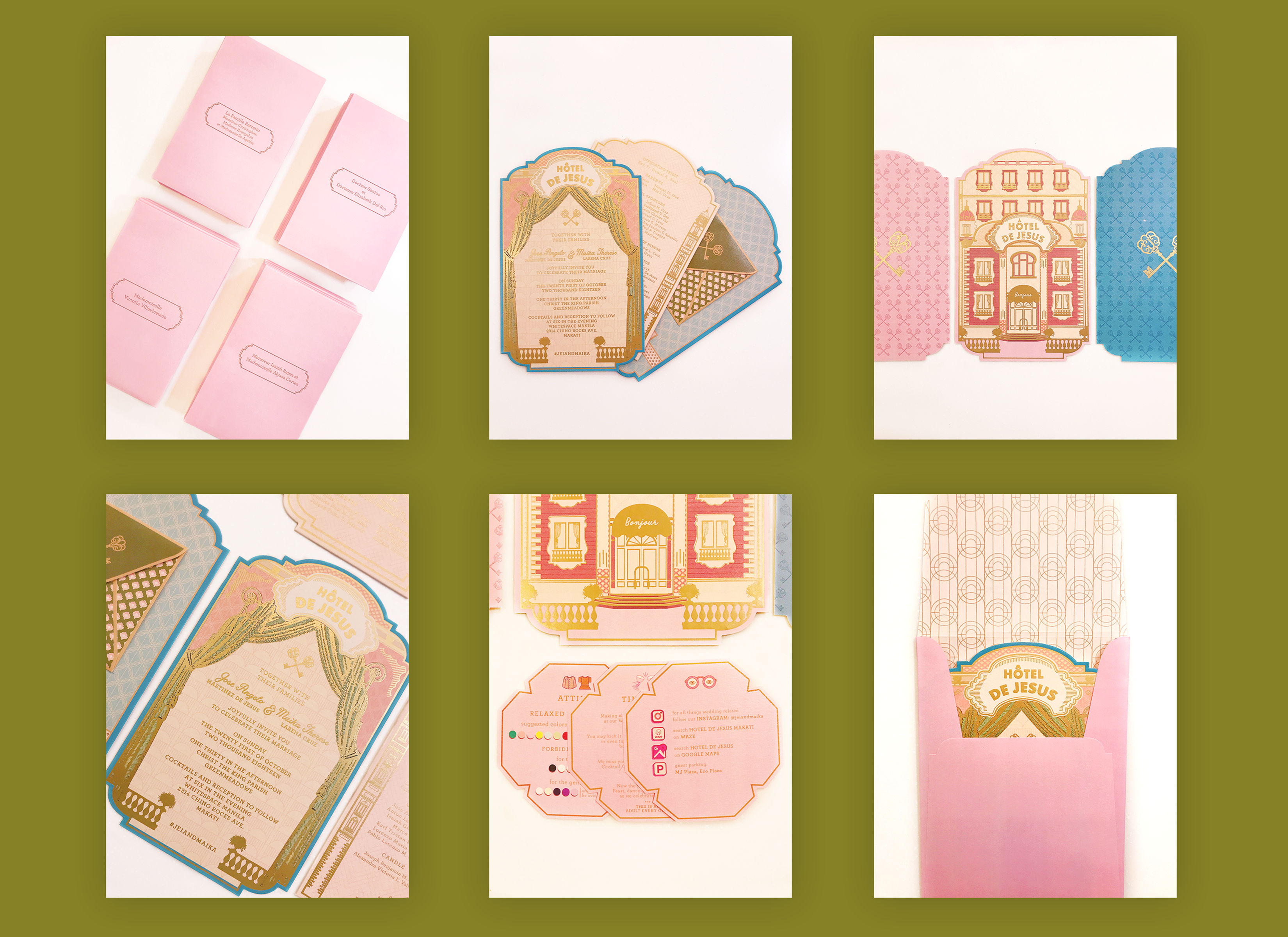
The main goal for this three piece wedding invitation was to keep it as symmetrical as possible and have the perfect balance with colors while everything in gold had matte stamping to add texture to the overall look. The couple aslso wanted to show their personalities through their invitation.
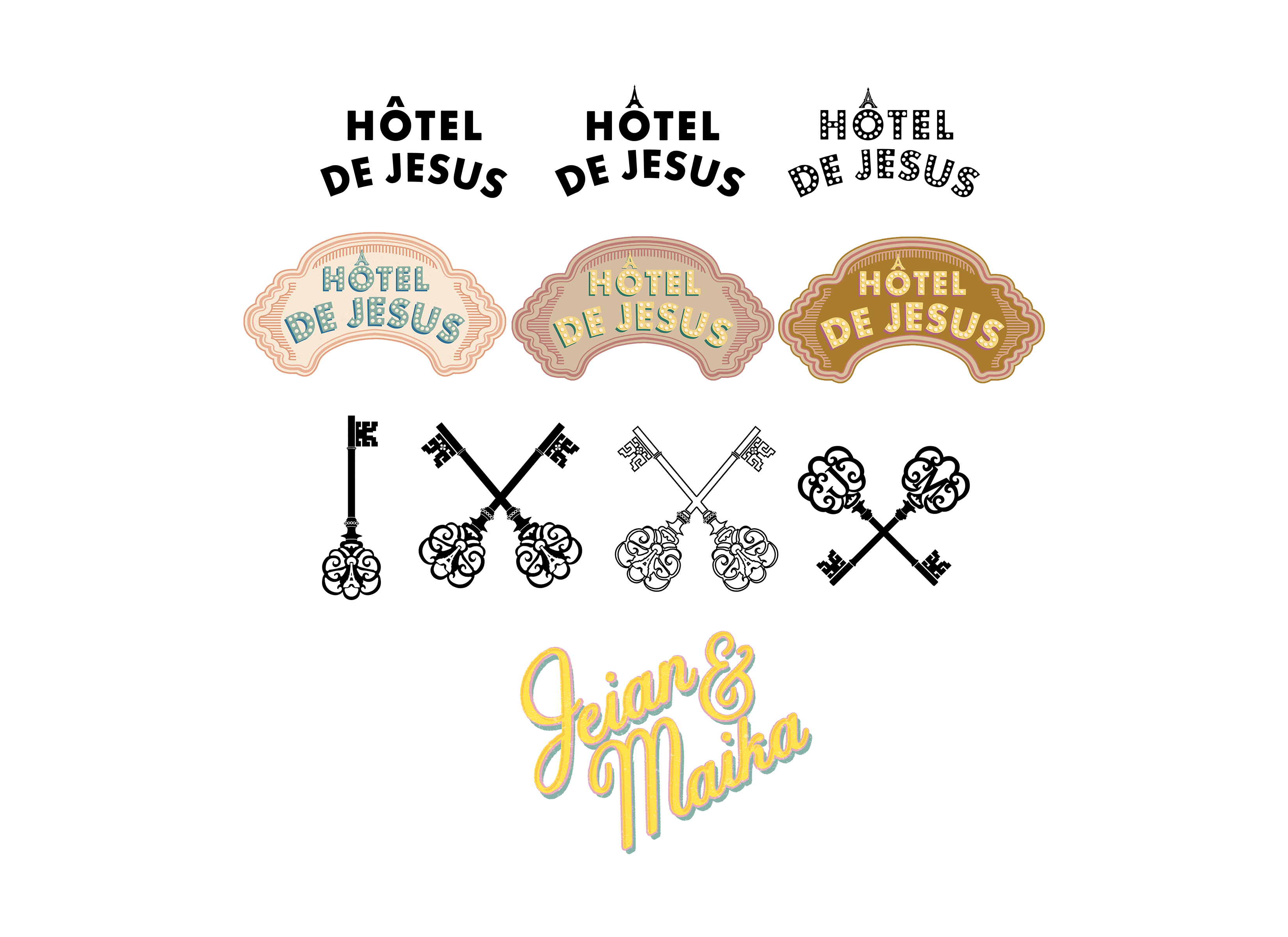
While designing the couple’s monogram for their wedding, they mentioned they wanted to incorporate a Parisian feel to it since they have been nostalgic of the place where they got engaged.
Save The Date
motion graphics
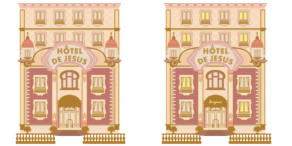
This six piece layout sequence concept for the couple’s digital save the date was inspired by Wes Anderson’s short films. The video starts of someting similar to entering a hotel and ringing the lobby bell while it transitions into a soft and mellow lounge music.
GIF sticker pack
motion graphics https://giphy.com/audreycruzz
Product PicturesAs seen from left to right: plain pink coordinated envelope, front side of wedding invitation, back side of wedding invitation, close up of main wedding invitation with matte gold stamping, mini inserts of information, printed side of the coordinated envelop
